
Color enhances the look and feel of a web page. But color can vitiate the user experience for some. Yeah, I too was unaware of it until I met Amelia.
It was a long train journey from Ontario to Alberta where I met Amelia. She was accessing a website on her laptop using high contrast mode. I observed her for a certain period of time. Then out of curiosity tend to ask her why she is using the high contrast mode. In response to my question she said that her eye is sensitive to the colors used on the site due to which she finds it difficult to read the text. On further conversation with her I found that she was having Protanomaly, a type of color-blindness that has reduced sensitivity to red light. I was unaware of the term protanomaly, so I tried to research on it and found that there are so many users who cannot read the text on website easily due to the low contrast ratio.
Every user sees the web page differently. So, now let’s see how various color-blind users see a web page. So here are simulated views with different types of color-blindness:
Normal view:

Simulated view :
- Color blindness that has reduced sensitivity to red light /Protanomaly

- Color blindness that has reduced sensitivity to Green /Deuteronomy


- Color blindness that has reduced sensitivity to Blue /Tritanomaly

After going through the different simulated view you must be feeling that it’s a big task to choose the right colors that would work for widest range of users ?
The next question that comes to mind is what colors should one use? Use colors that contrast well.
So what is the contrast that work for widest range of users?
Web Content Accessibility (WCAG) 2.0 provides parameters and contrast ratio to determine whether the two colors have sufficient contrast. Lets see what it says.
What WCAG 2.0 says about Color Contrast?
1.4.3 Contrast (Minimum): The visual presentation of text and images of text has a contrast ratio of at least 4.5:1, except for the following: (Level AA)
- Large Text: Large-scale text and images of large-scale text have a contrast ratio of at least 3:1;
- Incidental: Text or images of text that are part of an inactive user interface component, that are pure decoration, that are not visible to anyone, or that are part of a picture that contains significant other visual content, have no contrast requirement.
- Logotypes: Text that is part of a logo or brand name has no minimum contrast requirement.
So now that we have understood what are the color contrast requirements as per WCAG how can we ensure that the colors we have used meet the specified contrast requirements.
There are tools available that help in checking the contrast between foreground and background. Here are few tools.
Tools Used to check Color Contrast:
So here are some tools that I found handy to check the color contrast ratio:
- Colour Contrast Analyser – by The Paciello Group : It is a desktop application that works on MAC too.
- WebAIM: Color Contrast Checker : It allows you enter the background and foreground color to check the contrast requirements. It also provides lightness slider to adjust the shades of color to meet the contrast.
- ColorZilla – It’s is a Firefox extension that helps in checking contrast of various colors on website.
These are some of the tools there are many more tools available to check the contrast ratios.
How can we meet Color Contrast?
- Sufficient color contrast: For text to be readable by all user’s sufficient color contrast is required between foreground text with the background. You must be wondering how can we say a particular color has a sufficient contrast with its background?
Let’s see what all things do we need to check to say our site has sufficient contrast.- For text: Every website has lot of content in it. So, lets see the how can we make the text readable for all users without having any difficulties.
In the below image the pure orange (#F28500) “Accessible Documents” text has a contrast ratio of 2.6:1 with white (#FFFFFF) background. Thus, users with color blindness and low vision users might find it difficult to read such text. We can make the foreground color shade darker to meet the contrast ratio of 4.5:1. So for the same discussed example, we take a darker shade of orange (#F28500) colour i.e. #B45C15. Now let’s see the contrast. The Strong orange (#B45C15) “Accessible Documents” text has a contrast ratio of 4.7:1 with white (#FFFFFF) background that meets the requirement of 4.5:1. - Text on image: When text is provided on image with low contrast it strains our eyes which may lead to people ignoring the text. Thus, text on image should be avoided but if needed special care must be taken to ensure that the text is both clear and readable to users .
The text contact us is placed in an image of varying color shades due to which the text is not readable for people with low vision and color blindness. The white (#FFFFFF) text Contact us has a contrast ratio of 1.4:1 with the background image. To make the text clearly visible we can make the background darker or provide a color overlay behind the text to meet the contrast requirements. For the example discussed above we can add an overlay as shown in the screenshot below. The white (#FFFFFF) text Contact us has a contrast ratio of 9.6:1 with the background Dark grey (#454545) overlay. - For key images: Key images provide vital information to the user hence it is necessary. Thus, it is important to have sufficient contrast of the key image with the background. Alternatively, we can provide the textual description that meet the contrast ratio besides the key icon. For example, consider the next image button shown below.
The white (#FFFFFF) next icon has a contrast ratio of 2.7:1 with green (#4DB052) background. Thus, users with color blindness and low vision users find it difficult to identify the purpose of the icon.
The black (#000306) alternate text “Next” is provided adjacent to the key image with white (#FFFFFF) that meets the contrast.
- For text: Every website has lot of content in it. So, lets see the how can we make the text readable for all users without having any difficulties.


- High contrast themes: Provide user with alternative to access the web-page with different contrast scheme such as ‘style switcher’ option that will allow the user to select an alternate page style that adheres to the colour contrast ratios.
For example, the Newzhook website (https://newzhook.com/) provides its users with 2 color schemes i.e. default and high contrast to make its text clear and readable.


- Font size and style: If the website design or presentation doesn’t let you change the colors, then we can increase the font size or make the text bold to meet the contrast ratio of 3:1.Along with the color, the font size and style also play an important role for designing an accessible page. These are the other techniques to meet the contrast ratio of at least 3:1.
- Text is 14 point and bold.
The button text “Download App Now!” has a font size less than 14 and the white (#FFFFFF) has a contrast ratio of 4.3:1 with the orange (#D94900) background.Now that the text size of “Download App Now!” is increased to 14pt and made bold it meets the contrast ratio for large text. - Text is at least 18 point if not bold .
In the example below, we see that the strong orange (#CD7012) text Digital Accessibility Consulting has a contrast ratio of 3.5:1 with the white (#FFFFFF) background. Here the text is of size less than 18pt. Hence, we cannot consider as large Text.For the above-mentioned example, we can increase to text size to more than 18pt so as to meet a sufficient contrast with the background.
- Text is 14 point and bold.


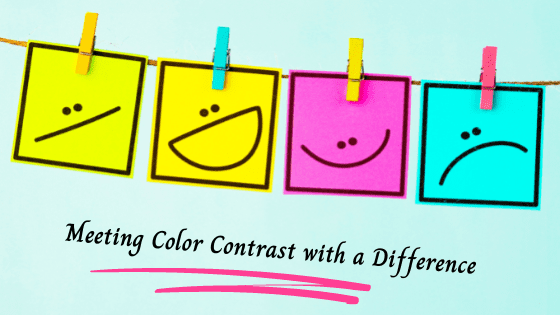
Color Contrast is vital to accessibility and these are some of the ways where we can meet color contrast with a difference. Do share your views if you have any other techniques to meet the contrast requirement.